The purpose of this project was to create a self-portrait using data collected about myself over the course of a week and represent it visually.
I started by tracking my communications, then narrowed my focus to three email accounts: personal; work; and school.
Between the sketches and the final, there was a careful balance of time, energy, design, and feedback. The result was quite a dramatic transformation.
The project offered much insight into effectively communicating information through data visualization, and inspired me to explore the subject more by taking an information visualization class with Ben Fry.
The final product was a 34″x32″ poster.
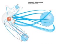
My final product (34″x32″ poster) shows the three email accounts, represented by blue spheres. Blue lines are incoming email. Red lines are outgoing. I get a lot of spam.

My communication data I collected over the course of one week.

Sketches were key in developing my idea and getting feedback.

Based on feedback received from peers, I shifted the orientation of the accounts to the outside with me at the center.

I presented this during an individual meeting with Dan Boyarski, who suggested I draw out every email as individual lines, all 682 of them. This idea intrigued me and reminded me of an idea Dan mentioned previously regarding Tufte: don’t be afraid of complexity; put complexity in, and let people build stories from that complexity.

But first, I did some more sketches.

Engaging viewers on both the macro and micro level was an important goal for the visualization.


Comments
3 responses to “Email Visualization”
I like the work you did, good eye.
Dwight
Yes pretty awesome. It makes me think at the Hierarchical Edge Bundles publication : http://www.win.tue.nl/~dholten/papers/bundles_infovis.pdf
Nice job.
Beautiful! Thank you for your work.