by Jamin | Oct 27, 2006 | Design
Ben Fry visited our design studio class again, this time to give a presentation instead of critiquing our work. He talked about the importance of being able to visualize complex data in order to gain a better understanding of what we’re talking about, for...
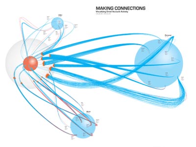
by Jamin | Oct 7, 2006 | Portfolio
The purpose of this project was to create a self-portrait using data collected about myself over the course of a week and represent it visually. I started by tracking my communications, then narrowed my focus to three email accounts: personal; work; and school....
by Jamin | Oct 4, 2006 | Design
Today I went to Martin Wattenburg’s lecture on mapping the invisible, during which he highlighted some of his work, including: Shape of Song NameVoyager Apartment I found the above three the most interesting. They’ve been around for a while, so...