Archive for the ‘Dan-Boyarski’ Tag

Searching for a New Head

Friday, February 29th, 2008

At the end of this semester, Dan Boyarski, the current head of the School of Design, is stepping down after six years. Dan has an inspired character and has done an excellent job representing the school. His personality and teaching ability helped seal my decision to apply to the interaction design program at Carnegie Mellon. Replacing him will not be easy.

The search for a new head is well underway, and with the looming end to Dan’s reign, the final candidates have been chosen to visit the school and present to the faculty and select students from the undergraduate and graduate programs. I was selected to represent the second-year interaction design graduates, and yesterday sat in on the first presentation. Throughout, I imagined what the presentation would be like if Dan were giving it. Unfortunately, the candidate did not compare.

I cannot name names or locations, and will not directly comment on the particulars of today’s candidate, but will submit some general considerations if you happen to be applying for the position of head of a school of design, or in particular, head of the Carnegie Mellon School of Design.

  • If you don’t seem excited, no one else will be. Leaders must excite and inspire.
  • Your presentation should be kick ass in a very designerly way. At a minimum, no centered text, overuse of italics, or orphans. Legible text and images, even better.
  • Don’t read directly from your slides (I know, this applies to everyone).
  • You should mention user-centered design at least once, perhaps often.
  • Do your homework. Don’t ignore important aspects of the school, like the unique graduate program. Specifically, don’t confuse CPID with information design, and also have something to say about the IxD program.

Of course, these are the bare minimum. I urge any candidate to shoot for blowing us away with your awesomeness.

The remaining presentations will take place over the next few weeks. After each, the attendees complete a survey to help the selection committee make a decision. I commend the committee for including students in the selection process, and feel honored to be taking part.

Visualizing Information Space

Thursday, December 21st, 2006

process-book-final201.jpg

This project required me to visualize information space for the book Else/Where Mapping. It was to be either interactive or a time-based video. I chose the latter, because it is where I had the least experience.

In combination with sketches, I prototyped ideas in Flash and experimented with animation early.

I used the mapped structure of the book as my theme, and overlayed information on top of photos of each page of the book.

The resulting two-and-a-half minute video is a journey through the each page of the book set to driving music.

still2
A still from the video.

The final video. (Size and quality reduced for Web.)

sketch1
I sketched early thoughts on animation combined with notes from the content of the book for inspiration.

sketch3
Another sketch shows early layout and transition ideas.

sketch2
To get a sense of what areas of the book I would focus on in each of the four section of the book, I created a story board.

Email Visualization

Saturday, October 7th, 2006

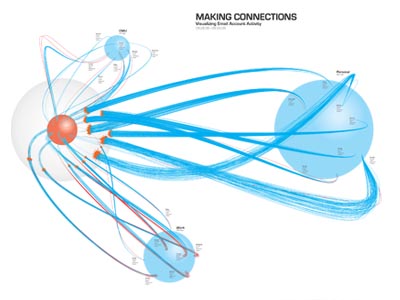
The purpose of this project was to create a self-portrait using data collected about myself over the course of a week and represent it visually.

I started by tracking my communications, then narrowed my focus to three email accounts: personal; work; and school.

Between the sketches and the final, there was a careful balance of time, energy, design, and feedback. The result was quite a dramatic transformation.

The project offered much insight into effectively communicating information through data visualization, and inspired me to explore the subject more by taking an information visualization class with Ben Fry.

The final product was a 34″x32″ poster.

email data visualization

My final product (34″x32″ poster) shows the three email accounts, represented by blue spheres. Blue lines are incoming email. Red lines are outgoing. I get a lot of spam.

data
My communication data I collected over the course of one week.

sketch1
Sketches were key in developing my idea and getting feedback.

sketch2
Based on feedback received from peers, I shifted the orientation of the accounts to the outside with me at the center.

early computer art

I presented this during an individual meeting with Dan Boyarski, who suggested I draw out every email as individual lines, all 682 of them. This idea intrigued me and reminded me of an idea Dan mentioned previously regarding Tufte: don’t be afraid of complexity; put complexity in, and let people build stories from that complexity.

sketch3
But first, I did some more sketches.

close up
Engaging viewers on both the macro and micro level was an important goal for the visualization.

Design Studio and Grad Type

Thursday, September 7th, 2006

I’ve mostly been talking about my Design Seminar class with Dick Buchanan and my Interaction and Visual Interface Design with John Zimmerman because those classes involve more discussion of ideas, which are easier to write about.

My other two classes, Design Studio with Dan Boyarski and Graduate Type with Karen Moyer (and later Kristin Hughes), are studio classes where the focus is on producing work for critique.

Data as Self-Portrait

In Dan’s class we’re tracking data about ourselves over a seven-day period. We are going to explore visualizing this data as a form of self-portrait.

I collected data about my daily communications: email (sent, received, and spam for three different accounts), IM (sent, received), phone calls (outgoing, incoming), text messages (sent, received), and hours per day in front of a computer.

Type as Self-Portrait

On a similar vein, in grad type we were given a construct, “I used to _________, but now I don’t”to create a typographic self-portrait using our constructions in a 10×10 space.

i-used-to-v1.jpgi-used-to-v2.jpgi-used-to-v3.jpg
These are in the order that I created them. Despite the text being all over the place, I felt the design was too conservative to represent who I really am. I moved to a more organic shape that plays with line breaks in a poetic way and has a sense of movement. The last one is a greater attempt to experiment.

My classmates seemed to like the first the best, with noted problems. I kind of like the middle for its poetics. But some said they liked the last. Design is subjective.

Next week we will explore using the same content for an accordian-type book. But I plan to continue working on these.

If you have any feedback, I’d love to hear it.

Portfolio

About

I am a graduate interaction design student at the School of Design, Carnegie Mellon University. » More about